I am super excited for my new design! After working non-stop for two weeks I have finally finished it. It has been a few years since last time and I really felt like I needed a fresh start of the year.
* This post contains affiliate links. In plain English, this means that I may receive a small commission (at no cost to you) if you subscribe or purchase something through the links provided.
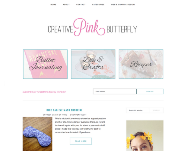
The first thing I did was start completely from scratch with an entire new theme. I decided to go with Brunch Pro Theme ( a Genesis child theme ). I love how simple, elegant and feminine this theme is. Here is a picture of my final design template.
I am so happy on how it turned out. Now lets take a look at the website design itself.
Menu Bar:
I decided to cut down my menu bar drastically and decided to choose 5 main links.
- Home – back to homepage
- About – about me page
- Contact – contact page
- Guest post guidelines
- Categories – a drop down menu with a link to all the categories.
- Web & Graphic design – in a new tab, my web and graphic design business website opens.
Logo:
My brand new logo! I love the complete simplicity of it. A feminine two font – two colour logo.
Top 3 categories:
The first thing you see after the logo is my top 3 categories. These lead to all posts within that category, however I am contemplating making individual pages with top posts, etc. We will see.
Subscribe:
Next up is my subscription boxes. Here you can easily enter your email address and you will get my newsletter straight in your inbox.
Post & Sidebar:
Finally my posts are shown. I have my favourite set-up with content on the right and sidebar on the left. I have a small excerpt and a picture. Too read the whole post you have to click the read more button or the post name. I also have some items in my sidebar, but you can check out those for yourself.
If you like this blog design, feel free to check out my web and graphic design website, and contact me for a chat.


I would love if you left me a comment :)