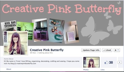
Today I am going to be talking about for inspiration and some of the things you must remember while creating your header. As I am running out of time for this post I will be creating another for the Tutorial soon.
If you cannot wait that long just know that creating a cover photo is really easy. If you go to Picmonkey.com and click on Create a Collage and in the Layouts there is actually one specific for Facebook Covers.
I need to create a new one because as you can see two of my photos disappear behind my profile picture. Below I have some examples of old Facebook covers.
In my opinion these are examples of BAD cover photos. The first one is way to simple, and the second is way to busy. I think the most important thing about your cover page is that it’s the only way to really give your personal touch to your Facebook page and you should incorporate you blogs theme.
Here are some examples of good pages: Thrifty Decor Chick, Ask Anna, U Create, Organizing Made Fun, Knock-Off Wood


GREAT TIPS thanks for sharing