My week has been super busy, but I have finally had time to create a new cover photo for my Facebook page. As I mentioned on my post on Thursday I have had some really bad cover photos.
It’s really simple to create a cover photo in PicMonkey.
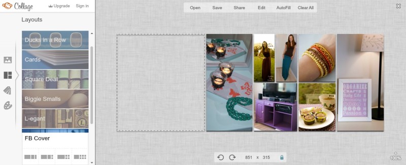
You Click on Create A Collage. In the layouts there one called FB Cover. This is the one you will be using. Then you just add the photos you want. I decided to use my favorite projects for this. You click on the background icon. I decided to change to a transparent background and have smaller space between the photos. When you are happy click the Edit button. This takes you into PicMonkey Editor.
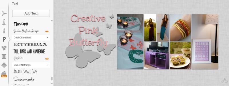
This is where I really would stick to the theme of your blog. What I have done here is incorporated the two items of my blog header. Remember that you display picture will be a part of the bottom left corner. This is why I have decided to have my next aligned with the top. When you are done, save it. Then upload it to your Facebook Page cover.
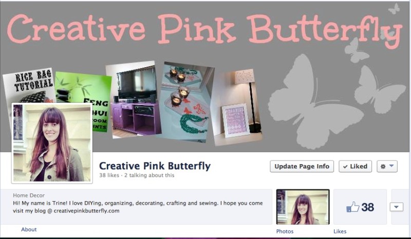
Before:
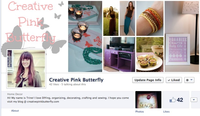
After:
If you take a loot the two different photos you can see the second one looks fresher and more organized than the first. I have chosen a range of photos from different categories on my blog. On the before photo two pictures are being blocked by my profile picture. On the second half a butterfly is blocked. Some might say this looks bad. I think it is something I can live with, and it looks better when the cover photo is looked at separately. I am however slightly concerned that my new cover photo has too many pictures in it, and I am wondering if it would be better if I cut out a column.
What do you think about my new cover photo?
Linked up to: Flamingo Toes, Dandelion Wishes, Clean & Scentsible and The DIY Dreamer


I actually like the “Before” cover photo much better than the “After.” It’s not as cluttered and I can clearly see the name of your page and understand what you are conveying. The second one just looks random and your name looks bunched up/crowded. Maybe if you deleted the column on the right end? Or even in your “Before” photo, try it with a white background? Just some suggestions.
I look forward to reading your blog – thanks for the great ideas and tutorials!
Thank you so much for your honest comment! I will definately keep that in mind the next time I update (which might be sooner rather than later)
Pinned this, thanks for sharing. I came over from the Inspiration Exchange.
Thank you for pinning, and you are welcome for sharing 🙂