The living room in a home is one of the most used and lived in spaces. From watching the big game to family game nights and hosting company, proper arrangement of the furniture can make a room more inviting and livable. The placement of your furniture can also set the mood for a room. If the room is cluttered or there is not adequate room to walk through the room, it can make you feel frustrated or overwhelmed. Certainly not the cozy feel you would prefer.
As a Certified Interior Redesigner, I frequently get asked “How do designers achieve a beautiful look without feeling cluttered or breaking the bank?” In this post, I’ll show you how you can rearrange your room for maximum impact.
Ready for your room to look and feel better?
1) Remove everything from the room (Yes, I know, it’s a pain to do, but trust me, it’s for the best). You want to be able to see the entire space and all of the elements without anything in your vision to distract you.
2) Vacuum and dust molding, windowsills and any other fixed object in the room. (It’s so much easier when there is no furniture in the way! You’ll thank me later!)
3) Look at the room. What are its features? Interesting architecture? A fireplace or picture window? What is the focal point? What is the room to be used for? Where is it located? (In the front or back of the house) Make notes (mental is fine) about these features and uses.
4) When you have determined the focal point, bring in the couch. Place it facing the main focal point (for example, the fireplace)
5) Continue by bringing in the largest items of furniture – one at a time. (Recliner, coffee table), etc.
Keeping the focal point in mind, place the larger items facing it. Chairs and recliners should be near the couch as a seating area. Furniture should be at least a hand width away from other pieces of furniture. (If you have several chairs, use just two and keep the rest for later).
6) Resume bringing in the furniture according to size.
7) Add the artwork (see below for some tips on hanging art)
8) Bring in the lamps.
9) Add the rest of the decorations and “knick-knacks”.
10) Step back and enjoy your beautiful new room.
Not sure about where to put what? There are some fantastic online tools that allow you to experiment with furniture placement. Better Homes and Gardens and Pottery Barn.
Some great tips to keep in mind:
Grouping is key. Keep like items together. For example, lamps on a coffee table. Items that go together should be placed together for uniformity and will add to the content feel of the room.
- Avoid putting too many large items of furniture along walls. Larger pieces of furniture look better and less cluttered if evenly placed around a room. Everything will be more balanced.
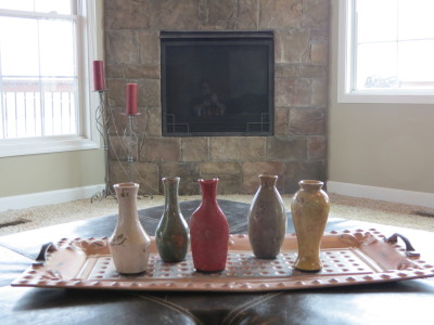
- Always use odd numbers. This is a staple design rule. Odd numbers are more pleasing to the eye. Think: three candles on a tray, 5 vases of varying heights on a mantel.
- Too many chairs? Consider placing two near a small table for a game area or reading “nook”. (Away from the main furniture and focal point)
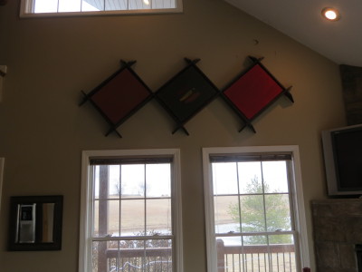
- Have high ceilings? Don’t neglect the upper walls. Adding art will bring the top of the room together with the bottom making it more cozy and cohesive.
- When hanging a mirror, consider what it will reflect. Do you want it to reflect the television? Or perhaps a beautiful window or artwork.
- If the focal point is the television, the rule of thumb is to take the size of the television and place it three times that length away from the seating area. For example, if you have a 42” television, place it 126” or 10.5’ from the seating area.
- Lamps add fantastic impact to a room. Well-placed table lamps and interesting floor lamps add coziness and ambient lighting to any room.
- If you don’t have any at home, consider picking up some hardcover books. They are great for decorative purposes and can be used as lifts to elevate collections for interest.
- Add greenery (even realistic looking fake greenery). Pick greenery in sizes that work with the room. If the room has large furniture, the greenery (and leaf size) should be larger. Greenery adds color, and if it is real, helps purify the air.
- Artwork should be placed at eye level and should be to scale. For example, if you have a 9’ couch, the artwork should be 6’. If you are hanging multiple pieces in a grouping, the “heaviest” or largest piece should be placed on the bottom left as our eyes naturally go to that first.
Doesn’t that look and feel better? We’d love to see it! Send a before and after photo of your room. We just may feature it in an upcoming post!
Until next time…
Sue


I am visiting from the SITS Tribe Building Challenge! These are good tips… makes me want to rearrange the house right now!
So glad you enjoyed! We’d love to see the results when you do!
Visiting from the SITS Tribe Building Challenge! Great tips– we are re-decorating a few rooms in our house and can definitely put these to use.
These are wonderful tips! It makes me want to look around and check all my focal points 🙂 Visiting from #SITSBlogging
I love the suggestion to not ignore the upper walls when you have high ceilings. That makes all the difference in the world between cozy and “warehousey”! Visiting from the Sits Tribe Building challenge….
Great suggestions, Trine. I need to remember many of these tips next time I re-arrange furniture. I din’t realize until I followed you on Pinterest that you’re from Norway. I’m interested in all things Scandinavian so I’m looking forward to your posts!
Fantastic advice! Very similar to what I did when I first moved into where we live now. I’ve never really felt the need to move things around since! 🙂